Friday, June 19, 2015

Watercolor sketches

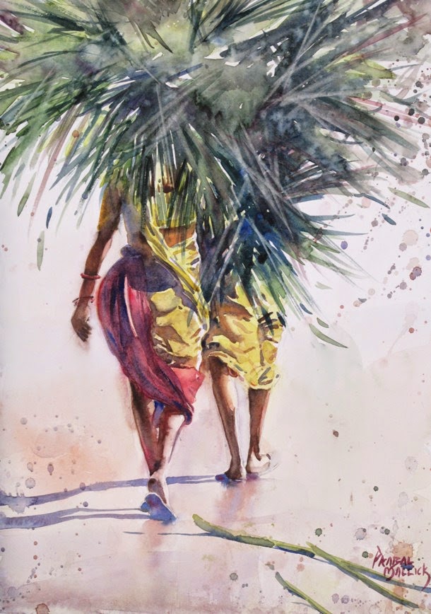
I dont always do a watercolor sketch before doing a painting. But generally I do it if I am not very conversant with subject or I have not been able to resolve the subject in mind. And sometimes I do it just for fun.

I never use fresh paper for these sketches. I use the unpainted side of paintings which have not made the cut (which gives me quiet a bit of paper to play with. ;)). And I do them quick and sometimes in a couple in parallel. And these are never bigger than half of a quarter sheet.

Here are few WC sketches. I'll post a few more in my next post.


Thursday, April 2, 2015

Winter Light III and IV

Here are the last 2 from my winter light (mini)series. While the last two had a dominant color, these two are mostly about the grays. The second one was a challenge as I was trying to depict the very first light of the day which hits the earth even before sun is visible on the horizon. The light is trying to break out of the haze of the winter morning. Such a difficult light to capture. But I was happy with how it turned out.


Winter Light - III
21 x 14 inch


Winter Light - IV
14 x 10 inch

Tuesday, March 17, 2015

Winter Light Series

The other series along with working class series that I was working on is now done. The series is called Winter Light. The winters here are the best time in the year in terms of temperature and humidity. The temperature is usually between 25 degree to 12 degrees. The quality of light is drastically different from how it is in summers. Its quiet soft especially in the mornings. In this series I have captured the light of different phases of winter mornings. Here are two of them. The rest I'll post in my next post. Thank for viewing. 


Winter Light - I
21 x 14 inch


Winter Light - II
10 x 14 inch

Sunday, March 8, 2015

Another One

Adding one more from my working class series here. This one came out quiet different. The subject also I thought was really different from my usual subjects. I did quiet like the final outcome. Hope you guys like it too.


Working Class - IV
14 x 10 inches

Thursday, February 12, 2015

Working Class Series

Its fun to work on a series. Its even more fun to work on more than one series in parallel. One of the series that I am working on right now is called Working Class. Posting all the work that I have done in that series till now. 

Happy painting.


Working Class - II
10x14 inch


Working Class - I
21x14 inch


Working Class - III
21x7 inch

Tuesday, December 23, 2014

Process

Finally. Yes Finally it is.. After a lot of coaxing by many of you I have finally managed to capture the WIP pictures of one of my works. And I am very happy to be sharing my process with you. When I say process it does not mean I follow the same process for every painting. Every painting is different and hence how it will be reached will be different. So the process that I am sharing applies to this painting only. 
This is the picture of the place. A quiet place with an imposing structure of a Hindu temple. A lovely atmosphere to paint in.

I usually do a few thumbnails and quick tonal studies before doing a painting. Here I just did sketching for about 10-15 minutes to get a feel of the place. I did not do any tonal studies as the idea was more or less clear in my head.


In the first age after initial drawing I went in for a warm under wash. Saw hints of  blues and reds in the foreground . So let some blues and reds mingle in in the foreground yellow ochre wash. I also distorted the perspective of the temple quiet a bit. This was done because I was predicting stiffness in the final outcome. So decided to play with the structure a little. Gave it a little 'gesture'.


In the second and most important stage I did a tonal block in of the major shapes. Transparent washes were used to block in. Note that I have made the color spire of the temple similar to the color of the temple. Otherwise I thought it would cause an unnecessary creation of a shape and clutter the painting. I wanted the temple to be a single shape. 


Now details on the wall of the temple have been done with dry brush technique. Note that there is much less detail in the back walls of the structure. 


Here figures have been added to complete the painting.


Back at home when I evaluated it I thought the figure was of same tone as the temple. So I darkened the figure. Also added the background tree on the top left corner. This foliage along with the figure maintains the green color throughout the painting, hence causing balance. The green color also compensates for the red of the temple as green and red are complementary to each other.


Plein air at Gada Khorda - 21 Dec 2013
10 x 14 inch

Thank you for viewing. I hope this is useful to some of you.

Have a happy Christmas and a great 2015.

Saturday, December 13, 2014

An acrylic triad

Last time I was in Kolkata I was enchanted by the beauty of the city. I was seeing paintings everywhere. The city has a personality and it reflects even in the non-living things out there. Specially in the buildings. Both old and ancient. Sometime they look like gaunt old men, sometime like a lady twisting her body and sometimes like children playing hide and seek. I was not sure how I would do this in watercolor. So I used acrylics, which allowed me to explore end experiment while painting. And a little experimentation with perspective distortion did seem to help the cause. I hope you enjoy these.


Personality City - I : YELLOW
20x14 inch


Personality City - II : RED
20x14 inch


Personality City - III : BLUE
20x14 inch